Case Study: Connect Immigration System
The Company
Established in 1951, this firm is a leading immigration services provider (providing mainly legal services). The firm is widely accepted as the expert in the field of business immigration law, as they focus solely on that field, and have many decades of focused experience. Originally one office, the company has grown to over 40 offices around the world, serving countries in all regions.
Purpose
The purpose of this project is to improve the UI of a client-facing intranet-dashboard for an important law firm. This case study highlights the background of the company, the use of the system, example pattern updates, and plans for a future redesign.
Marketing
The company tagline is “a world of difference in immigration.” Another commonly used phrase in their advertising is “our world moves beyond borders.” There are a few main points in the company’s branding. First, they market themselves as experts in immigration law. Second, they put a great emphasis on doing good and opening possibilities to capable professionals all over the world (as well as celebrating diversity in race and gender both within and without the firm). And third, they pride themselves in their technology, which includes 24/7 client access to data and real-time status updates. This firm established their immigration online home page far ahead of the curve, in 1996.
What is the purpose of the system?
The purpose of the technological system is to make the immigration process easier for business professionals. Immigration is a difficult and lengthy process. The immigration-specific case management system allows foreign nationals, immigration HR professionals, and employers to follow a case from beginning to end, find information, and access and submit documentation.
IHP, WWIHP, Connect
The original Immigration Home Page was established in 1996. This website served most domestic cases.
When the firm expanded to serve international clients, the Worldwide IHP was created, with significant improvements to the interface. It was never fully integrated, and only 10-12 clients currently use the WWIHP. IHP continues to serve clients in the United States.
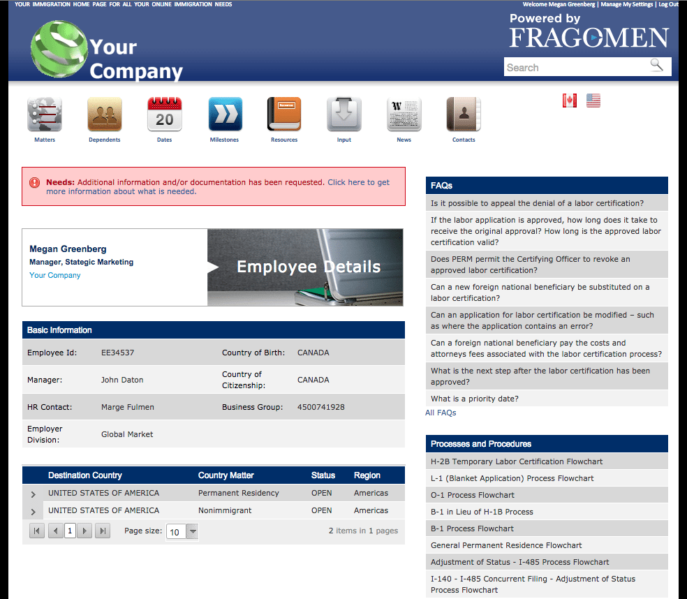
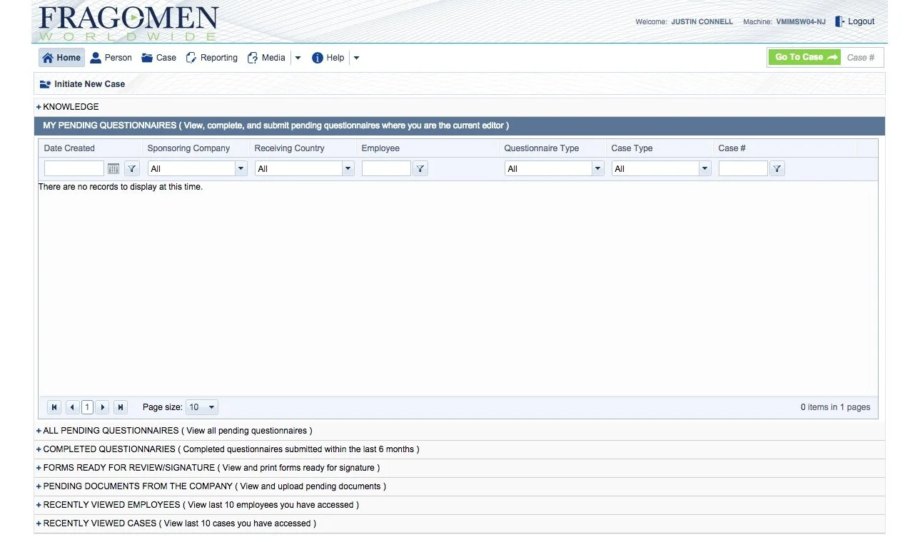
Recently, a new system called Fragomen connect was developed, which is intended to bring together the domestic and worldwide systems into one. Currently, the interface needs much improvement in content and design patterns. The following pages include the homepage of each site.
Goals for Connect
The ultimate goal of Connect is to make the immigration process easier and more efficient for all involved. Ideally, the users will find the transition seamless (from either IHP or WWIHP), and will understand what their responsibilities, needs and deliverables are. They will quickly understand what is required of them, and get real-time updates on their process, as well as access to FAQs and need-to-know information. The ease of these processes will improve client satisfaction and the firm’s reputation.
User Persona
User Access Needs
Since each existing system had some speciality features and needs, I created a compatibility chart so that we could figure out which features would need to be in the ultimate system.
Competitive Research and Pattern Examples
Design Analysis
UX Improvements
Help Section
Problem
Currently, the help section needs to be relabeled and redesigned. As is evident from the screenshot below, there are a few different categories listed for help. The vocabulary used is ambiguous and unclear.
Solution: Change Language and Patterns
Firstly, there should be a general “help” page, which can be accessed by clicking the help button. This page will have to be split into sections, for example, “Connect System Help” and “Immigration Process Help” should include an auto-populating search function, as well as a list of questions within each section.
Secondly, to replace the “Contextual Help,” help should actually be in context. Each section will have a small icon (i) next to it, which will be activated upon clicking and bring up a small popup with help information.
Footer (Add)
There is no footer on Connect as it stands. This is an easy and essential addition. A footer should include at least Contact, Copyright, Privacy Policy, About and Resources. IHP had an acceptable footer, but its style is outdated now. WWIHP has the best of all the footers, but it has an excess of information; the information that is found there is not extremely helpful, or expected.
Footers should be at the forefront of thought when designing a website. Many people scroll straight to the footer if they cannot find something, or even before they try to find something elsewhere.
There is room for discussion on this issue. As it stands on the new (front-facing) website, the footer is a very simple, single line. A larger footer is included as a part of the left-hand navigation menu, which appears quite handsome, and is very convenient. It is possible that there will be less need for a footer on Connect, if the content makes sense elsewhere.
Header and User Navigation (Add)
Currently, Connect implements a user header which includes the user identity (name), a strange machine identity number, and a logout button. The header also includes the Fragomen logo. One important addition to this header will be the company’s own logo. This homepage needs to feel like it belongs to them. They must feel familiar and at home when they log on.
In a better system, each company will have its own branding, and each user will have their own branding as well, i.e. their name and an image, as well as a choice of language. Elsewhere on the page there may be more customization, such as images of flags suggesting that “we at Fragomen know your case. We know that you are immigration from [UAE] to [Australia].”
Icons
Problem: Icons are Not Intuitive
In certain places where icons are used, they don’t make sense. A great example is under the documents section of a case. Instead of using meaningful icons, the interface uses the download symbol to mean 3 different things (download, upload, and “uploaded/not uploaded yet”). It’s not entirely clear which is which.
Solution: New Icons
This would be an easy fix. If better icons were used, the user would know what the meaning was. Most importantly, the green and red icons would make more sense as green check marks and red x-marks. The x-marks could also be left blank until the file is uploaded. One good example from page 16 of this case study is a checklist of done items and items left to be done.
Mobile and Responsive Design
As a secondary process, I created some wireframes for responsive mobile designs.


