E-Commerce Loyalty and Travel SaaS
The Business
Switchfly is a premier B2B2C travel eCommerce platform used by the most recognizable airlines and credit card loyalty programs including American Airlines, JetBlue, LATAM Airlines, American Express, and Mastercard. The business channels approximately 2 million dollars of revenue per year. The software and my work touch a variety of users via various platforms: clients (admin tools), end users (shoppers), and agents.
My Role
I worked on a team of UX designers to provide data-driven, user-centered solutions, while collaborating with developers, business owners, product owners, and directly with clients. Work and specialty knowledge included:
Audits and designs improvements
UI mockups and prototypes
User tests and data reports
Frequent changes to the product and client co-brands (AMEX, American Airlines, Merit, British Airways, etc.)
Advocating for accessibility (a11y) challenges
Complex travel booking scenarios
E-commerce software
Loyalty and points redemption
Merchandising
Partnering with 3 of the top 4 global airlines, all of the top 3 credit card travel services, and one of the largest hotel chains to build customer loyalty and revenue
Projects I Drove and Led
Note about designs: because I was brought on to work on an existing platform of complex software, I had many limitations in both design and function. Part of the fun and excitement in software is solving for these problems, though in some cases, I may have solved something differently without such limitations. I have learned to shoot for the stars but adapt and evolve as necessary.
Add photos to hotel room cards (desktop and handheld)
Previously, end users could only view photos of the hotel. After some competitive research, I suggested that we prioritize adding photos to room cards. I had found that we were receiving the photo data from connectors, and could be showing it if we developed a method of doing so. Thanks to my research, mockups, advocacy, and work with developers, we now have photos on our hotel cards, an improvement which thrilled clients and users.
New page for reviewing cart before checkout
This new page was a part of a number of improvements I wanted to make to the checkout process. Clients now have the opportunity to turn this page on or off for their users.
Added methods by which user can select car rental location before seeing a list of results
Reasoning: this reduces the number of pings to the backend connector (Expedia). Now, only results from each location will be pinged. This reduces the technical and financial strain. Below are prototypes I created in Axure:
Checkout page organization improvements = increased conversion in 4+ markets
Working with AMEX and our internal dedicated client team, I made improvements to the checkout page, which led to increased conversion as a direct result. Previously, the user saw pricing tables at the top of the checkout page, but didn’t have an option to apply points (using a points slider) until much later, near payments. I reorganized the page and moved the slider up, so that users could choose how many points to use before getting to the payment section. These changes applied across the platform to all clients.
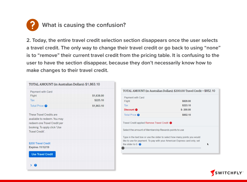
Case Study: fixing issues with Travel Credit section on checkout page (PDF)
Click the images for full PDF case study (my presentation to the client of improvements, in problem-solution format). There were several problems causing confusion and frustration for the user. We solved each problem one at a time, and users were thrilled (as well as the client, of course).
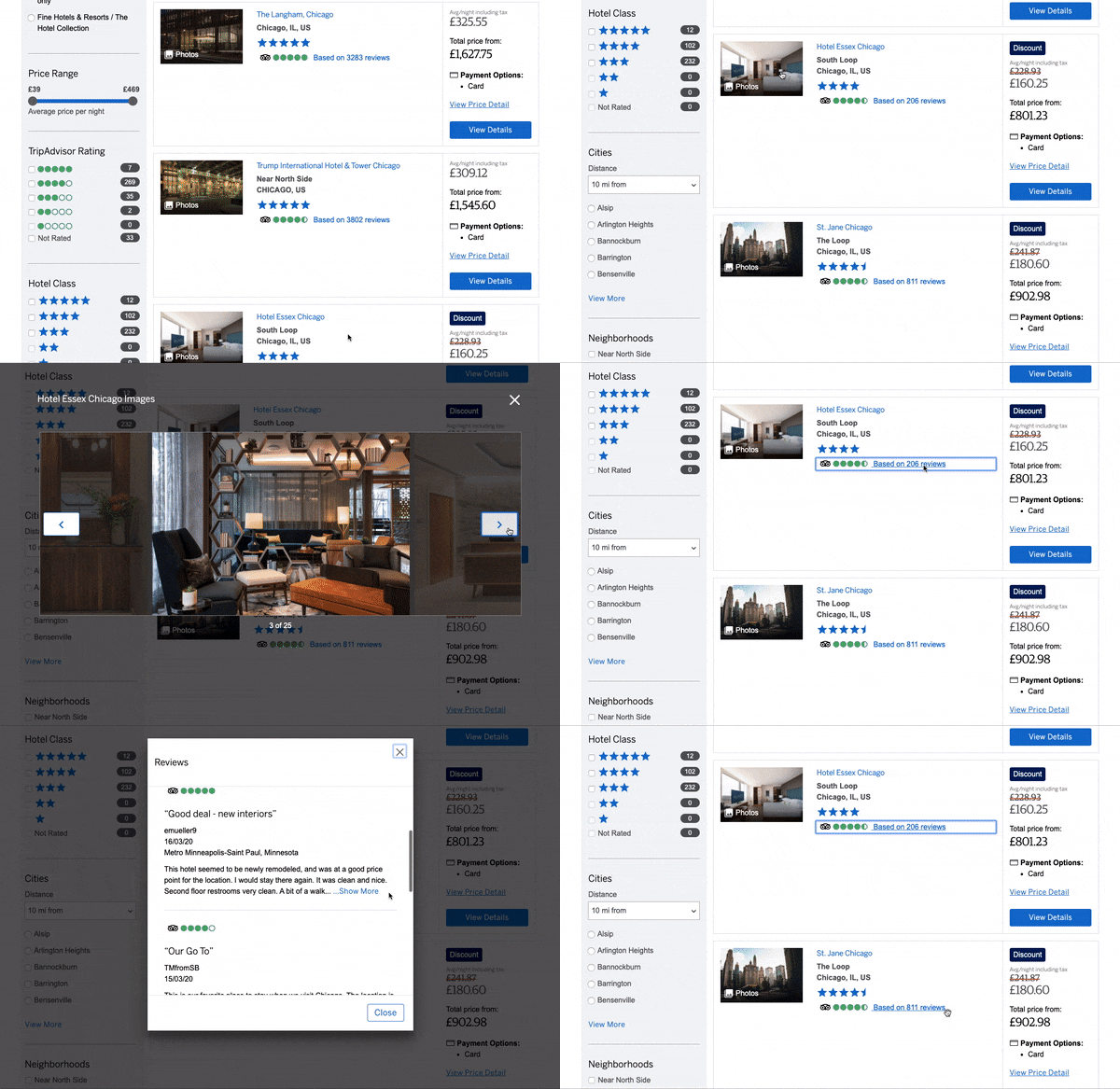
Add modals for viewing Trip Advisor reviews and hotel photos on the results page
Before, a user had to open the Hotel Details page in order to view the reviews and photos. My solution reduced the amount of back-and-forth for the user, and allowed them to feel more sure of their choice before ever getting to the Hotel Details page. Once they are there, they can focus on selecting a room instead.
Added photo label and icon to the clickable thumbnail
Once the engineers made the thumbnail clickable (phase 1), I added a label and icon to make it clearer to the user that the item was clickable. Analytics were run before and after and found that significantly more users clicked on the thumbnail when the descriptive label was present.
Design improvements to TripAdvisor reviews based on user test data
The current display does not make use of all the data we receive from the TripAdvisor partner API. My enhancements add several visual categorizations to help the user understand the reviews.
Before:
My API findings revealed that we could be showing a lot more data:
My recommended improvements:
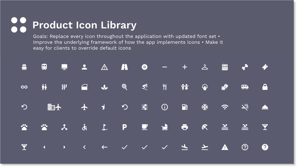
New platform icon library, and client override ability
A library allows a special semantically-correct code to be assigned to each icon, so that a client can replace each icon without changing the code, if so desired. This is helpful in allowing cobrands to fully fit their brand and style. The new default library I compiled was more semantically accurate and was stylistically more modern.
Compiled data published in the New York Times
Promotional banners added to homepage promotions
Rebranding for AMEX hotel programs
This project required a lot of coordination with the client (AMEX), their third party design consultancy, and our developers. The nature of how information from connectors is coming through creates some limitations in what can be customized or how it can be displayed.
Before:
After:
Hotel details reorganization
Originally, our hotel details page wasted a lot of space under the “map” column, and the room selection section was very far down the page. I tested and discovered that users care very little about the hotel description. Based on my changes, we created a hotel summary below the photos, and then removed the map from the side panel to allow the page to be full width.
BEFORE:
AFTER:
After that phase one, I had some more experimenting to do. Based on user feedback from tests testing our platform and competitors’ platforms, I suggested these changes to the hotel details page.
Further improvements:
Audits and minor UX fixes
As part of my work, I also handle smaller design fixes, some of which I discover in passing, some of which are assigned to me.
Audited air cards and noticed that the full-width button was not performing properly.
Called out discrepancy with button sizes
Recommended that client change active button color on calendar. It looks too close to the “grayed out”/inactive buttons. The client has the power to update their theme colors.
Filed a bug for misalignment of elements
Filed a bug for button size which is larger than other form fields.
Suggested updates for handheld header organization to make logo larger and stack elements.
Special Service Requests (physical accessibility in travel)
After user selects from the dropdown that they need special services, then these options for SS categories appears.
They can select one or more category, and each time the final specific options will become available. At many airports, there are only a few options of special service requests, but often there are more. This categorizes the options for the user. The message is not always relayed to the airport, so there is a note reminding the traveler to confirm with the airline or airport.
Solving for complex payment redemption scenario
This was one scenario where the client came to us with a solution. I pushed back and questioned what the actual problem was, and we discovered that users were unsure what they could use their points on, because they were seeing results under “Fixed Points Travel” that they didn’t qualify for. We were able to solve this by graying out the Fixed Points Travel toggle and only allowing the user to see the eligible results, which are under Flexible Points Travel. Pricing, payments, and redemption are the most complex aspect of the software. This project required a lot of conversations with the engineers, product owners, and the client.
Special package landing page
Pre-packaged travel is a rare feature in our software, and most clients don’t have an infrastructure set up for it on the user-facing software (as opposed to the agent-facing software). This was the first time we’d created a landing page for a pre-package trip (special). Our client needed a landing page where the user could come directly from a promotional email or homepage promotion. I created this page, which features a search and all the necessary sections, which are customizable within the client admin. From here, they go through the normal Switchfly software flow of products (flight, hotel, car, activity), where they will see more limited options based on their specials search.
Checkout page improvements: plans for future state
I created this prototype as one part of a series of tests to see if users prefer a multi-step checkout, and to suggest improvements to our form fields, trip summary page, and confirmation page.
Allow users to decide whether they will pay now or pay later immediately after room selection
The complexity of pricing was causing some problems with allowing a user to pay the way they want to. With a new connector-vendor, we were suddenly able to offer a choice between “pay at hotel” and “pay now.” This modal is a way to force the user to choose the path they will continue on, immediately after selecting a room.


